What Are Buttons? (And Why They Matter)
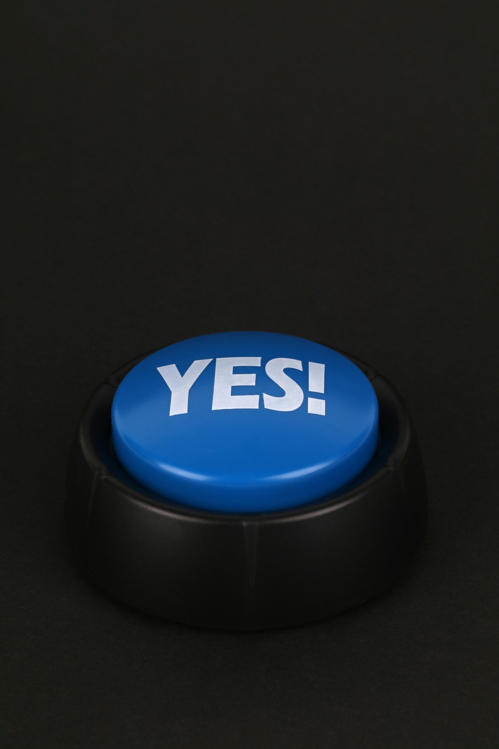
A button is a clickable element that lets users take action like submitting a form, navigating to a new page, or opening a pop-up. It’s one of the most direct forms of interaction between a user and a digital interface.
✅ What Makes a Good Button:
-
Clarity: The button’s label should clearly say what it does (e.g., “Sign Up,” “Add to Cart”).
-
Visibility: A good button stands out on the page — with contrast, color, and sometimes animation.
-
Feedback: A click should lead to a visible result (loading, color change, confirmation, etc.)
-
Accessibility: Buttons should be keyboard-navigable and screen reader-friendly.
📌 Common Button Types:
-
Primary Button: The main call-to-action (e.g., “Buy Now”)
-
Secondary Button: An alternate action (e.g., “Learn More”)
-
Text Button: Usually minimal, used for things like “Cancel” or “Forgot Password?”
What Are Separators? (And Why They Matter)
Separators — also known as dividers or lines are visual cues used to group, split, or organize content. They’re not interactive, but they make a huge difference in how users perceive structure on a page.
Think of them as the silent helpers of design creating breathing space, clarity, and logical flow.
🧩 Uses of Separators:
-
Divide sections of content (e.g., between pricing plans)
-
Group related settings (e.g., form fields under different headings)
-
Add visual rhythm to long pages or lists
📐 Good Separator Design Tips:
-
Keep them subtle — usually light gray or soft lines
-
Avoid overuse — too many dividers can clutter the UI
-
Use padding around them — space is just as important as the line itself
How Buttons & Separators Work Together
Buttons invite action, while separators guide attention. Together, they:
-
Improve usability
-
Boost visual clarity
-
Create a natural flow from information to action
Imagine a checkout page. Separators break the process into steps. Buttons drive each step forward. Clean, simple, effective.
Final Thoughts
Buttons and separators might seem small, but they’re foundational to good digital experiences. If you want users to feel confident and comfortable using your product, pay attention to these details. Design isn’t just about making things look good it’s about making things work better.
Looking to improve your product design? Start by asking:
-
Are my buttons clear and purposeful?
-
Am I using separators to organize, not overwhelm?
A few thoughtful changes here can elevate your entire interface.


